There’s a lot of change going on at Google. Last month, the company announced the creation of Alphabet, making Google just one company underneath the larger umbrella which also houses some of its more ambitious endeavors.
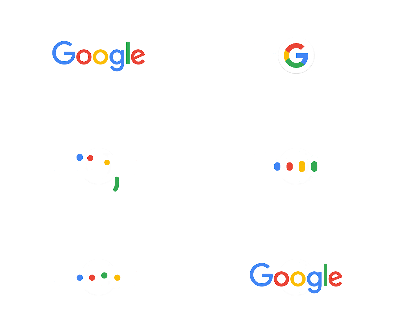
But Google itself, which has seen a great deal of change over the years, is getting a new look, “identity family,” and “visual language”. Basically, it’s getting a new logo and look-and-feel. Google explains in a blog post:
As you’ll see, we’ve taken the Google logo and branding, which were originally built for a single desktop browser page, and updated them for a world of seamless computing across an endless number of devices and different kinds of inputs (such as tap, type and talk).
It doesn’t simply tell you that you’re using Google, but also shows you how Google is working for you. For example, new elements like a colorful Google mic help you identify and interact with Google whether you’re talking, tapping or typing. Meanwhile, we’re bidding adieu to the little blue “g” icon and replacing it with a four-color “G” that matches the logo.
This can explain even better:

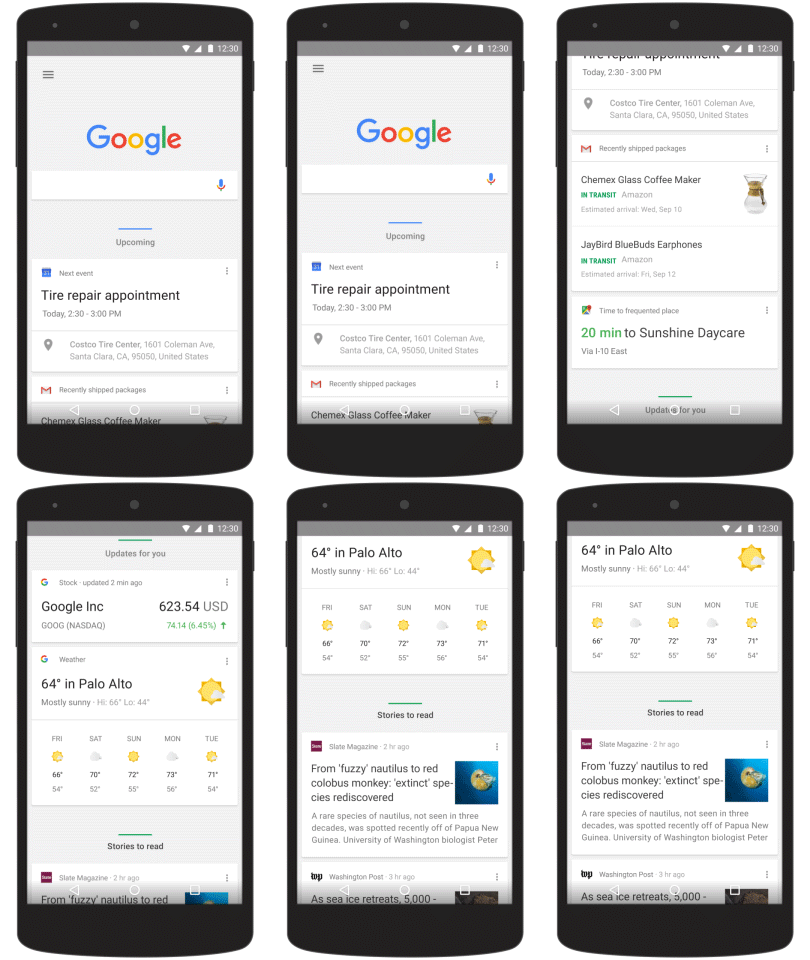
It’s not just about the logo and dots though. Google has also upgraded the search results page on mobile. Here’s a look:

On Android, the “home page” of the Google app has been adjusted to organize Google Now card by category to make things more predictable. The cards will shift and change size based on importance as the day progresses:

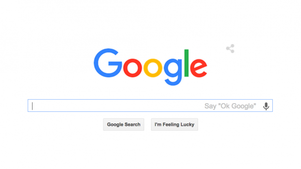
Here’s a look at Google’s evolution:
Images via Google


 WebProNews is an iEntry Publication